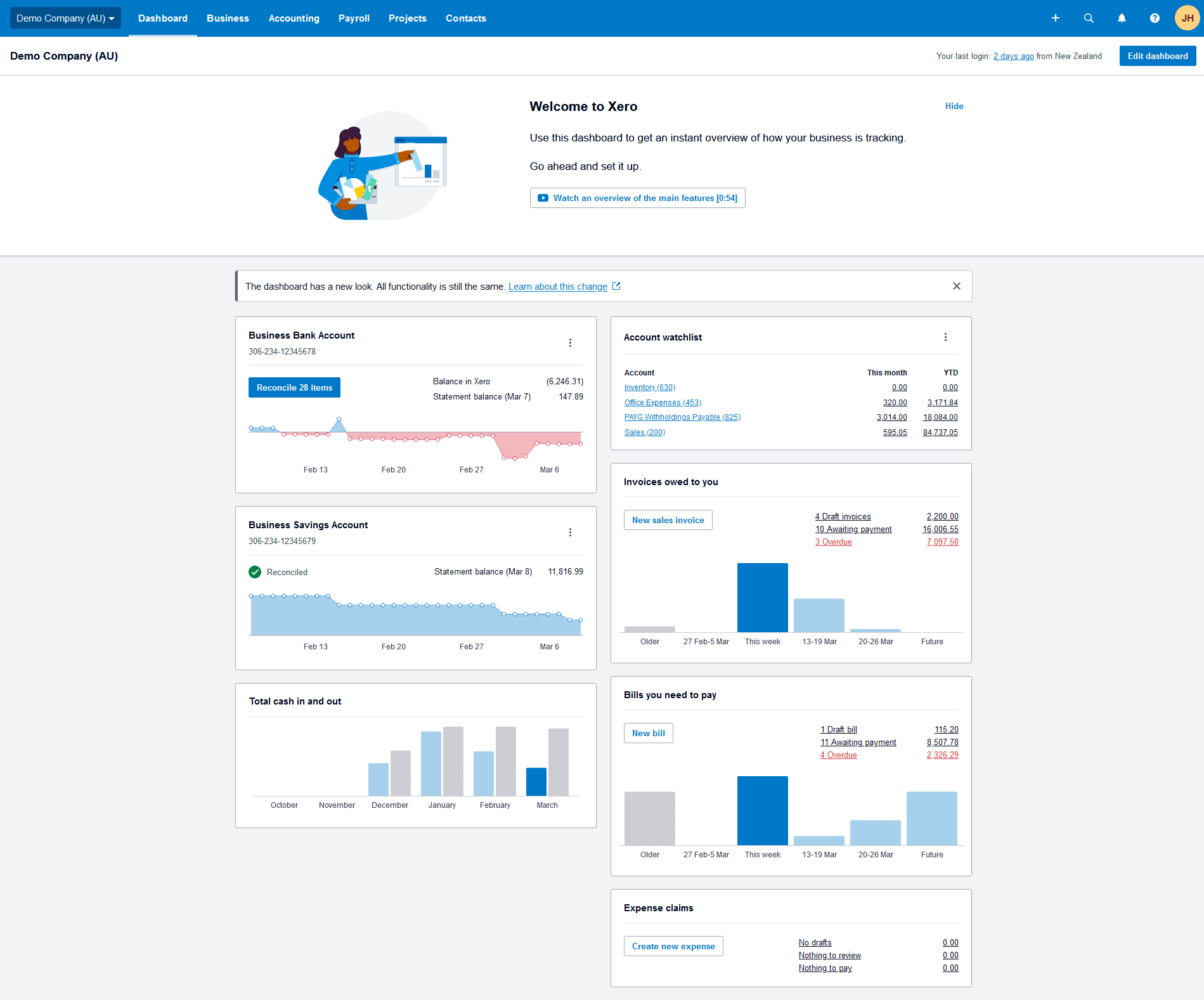

In the months ahead, you may notice that your Xero dashboard looks a little different. It’s all part of our work to upgrade the technology that underpins our platform, so it doesn’t slow us down over time. Just as you need to upgrade your phone every few years, we need to update Xero so we can continue to build the features that you need in your business or practice.
The functionality of your Xero dashboard won’t change, but there are some small tweaks to the design that may take some getting used to. The new version is designed to give you a consistent experience across Xero, while also improving speed and accessibility. Here’s an overview of the changes you can expect to see soon.
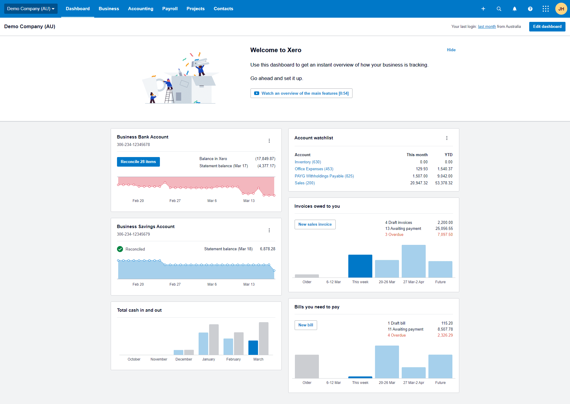
What’s changed?
- We’ll introduce a new ‘hide’ button instead of the old ‘x’ button on introduction and welcome banners, which will run across the top of the screen
- The ‘edit’, ‘save’ and ‘cancel’ buttons will be located in the top-right corner of your screen, instead of the bottom
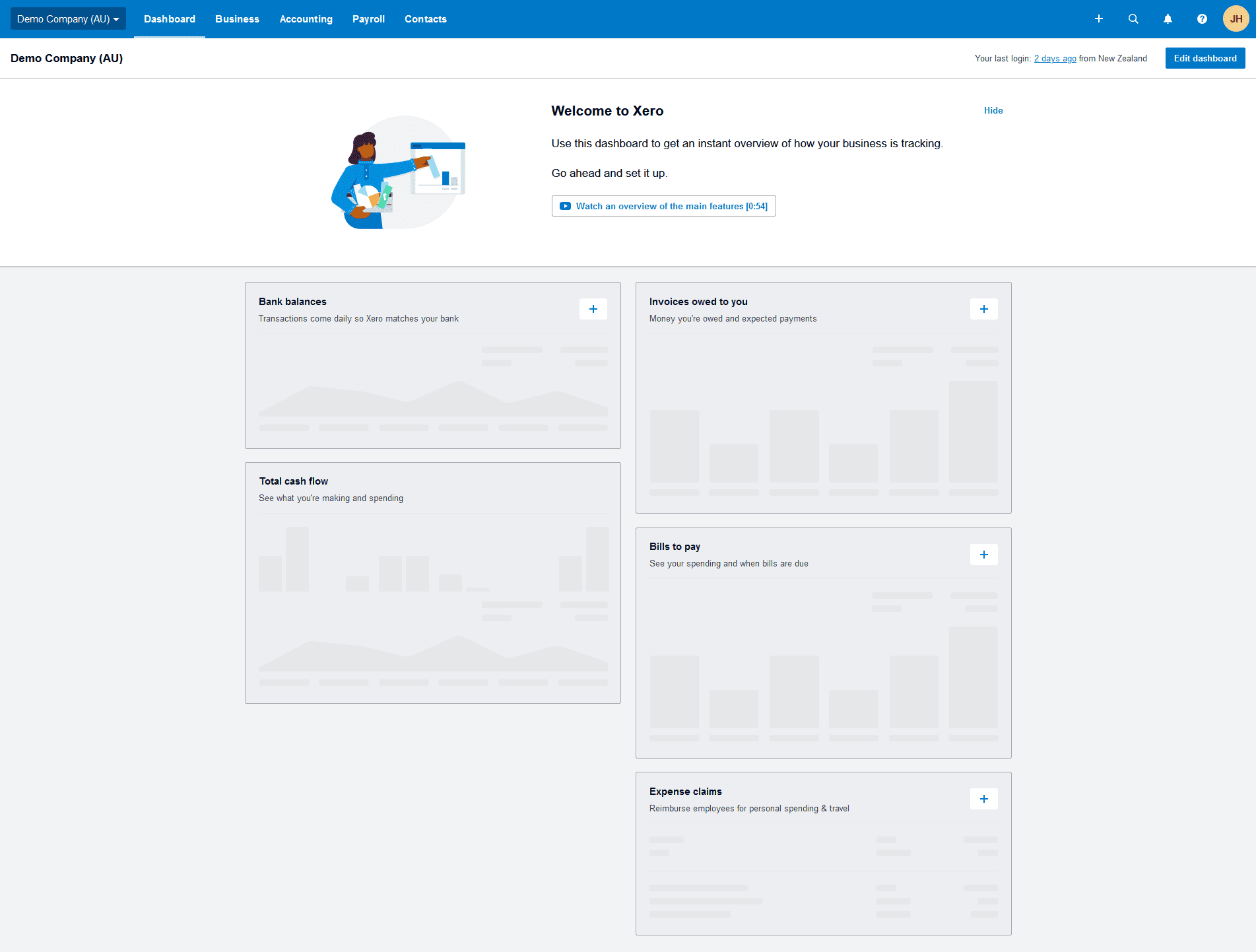
- If you’re an accountant or bookkeeper, you will notice new names and descriptions for each widget when setting up a Xero account for the first time
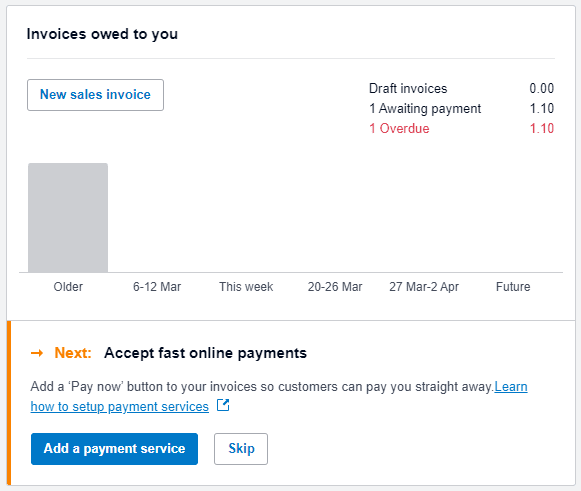
- A new colour strip on the information panel below widgets will help you understand what step to take next (orange strip) or any errors (red strip) at a glance
- When editing your dashboard, you’ll be able to select or unselect a ‘show’ checkbox, instead of clicking the ‘hide’ button
- The drag icon will be at the bottom of the widget instead of the top, and there’ll be a yellow placeholder that will appear when you move widgets, so you can see the location more clearly


We’re always listening
We’ve had a really positive response from customers who have tested the new dashboard as part of our design research panel. We will continue to listen to your feedback on the features you’d like to see in the future, so we can make it easy for you to keep an eye on your finances and stay on top of your cash flow.


