

1 day Product Updates
Streamline year-end: A new accounts production experience for Xero UK
3 min read
Last updated: Aug 29, 2025

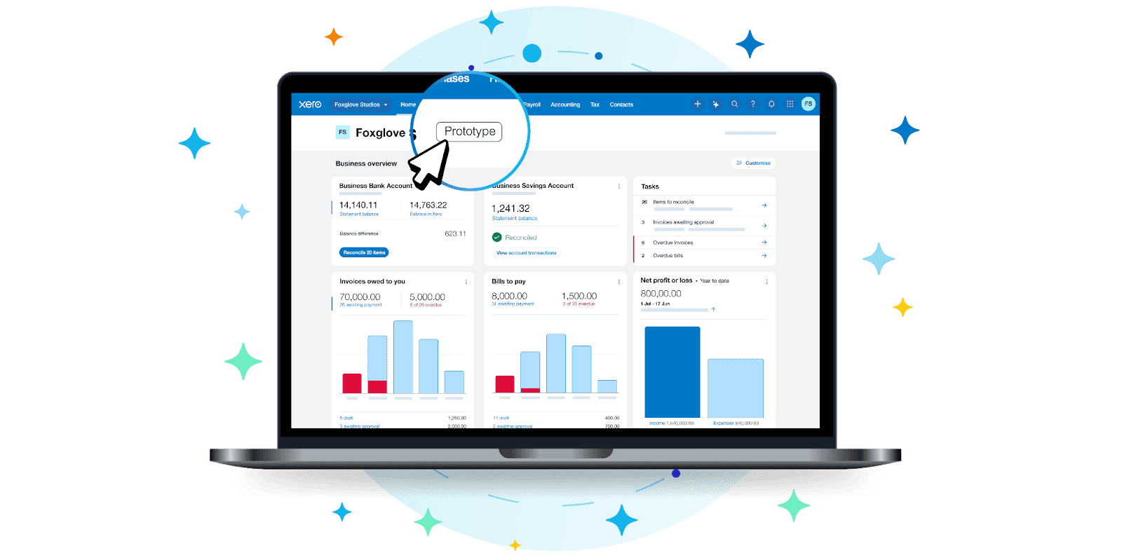
Get ready for Xero’s new navigation and homepage, which will be available to all Xero customers soon. We’ve been busy talking to our 30,000 beta testers to find out what they love about the new experience (and what they think we can improve).
We’re not just listening, we’re putting your feedback into action. Feedback from beta testers has already informed several upcoming improvements, including how we present third-party apps, prioritise key elements in the navigation, and surface the most relevant information in the banking widget.
The good news is you don’t have to be a beta tester to try out the new experience before it’s available later this year. Head over to the new navigation and homepage web page to test drive it for yourself using an interactive prototype.
Here’s what two of the beta testers have told us about their experiences.
How would you describe the overall experience? Has anything stood out to you as significantly improved?
The whole design is more sleek and modern. I also really like the ability to customise the widgets according to the information that I want to see. I like the recent invoices paid widget because we rely on meeting invoice milestones before we do certain work, and previously that information was a lot harder to find. Now it’s really quick – I can see it at a glance, so it’s a lot more streamlined and means we’re moving faster and getting projects completed more quickly.
I also love the cash in and out widget. That used to be at the bottom of the dashboard, and now it’s my first widget because I like to see how much money is coming into my bank account each month – I check that, if not once a day, twice a day, every day. That’s the most important information I want when I open up Xero – I love counting my money!
How has the new homepage saved you time or made a process more efficient?
In terms of what’s important to me as a business owner, the main things that I do in Xero are checking my cash flow and what invoices have been paid. Being able to customise the widgets to put these two front and centre is definitely saving me time. Before the recent invoices paid widget, it took three clicks to get that information; I’d have to go through the awaiting payment widget, which was a lot slower and clunkier. It’s also been less of a barrier for my team, who aren’t as familiar with Xero. Now, they can just go and look at the homepage instead of having to search for that information (or ask me!).
What advice would you give to other Xero users who might be feeling nervous about the new navigation and homepage?
I think that Xero has done a good job in making it very simple and intuitive. So while there are changes to navigate, it’s not onerous and it’s easy to find what you need. I just dove straight in and it didn’t take long to figure out what had changed.
If you had to sum up the main advantage of the new homepage in one sentence, what would it be?
Simple, clean and beautiful.
What’s your favourite thing about the new navigation or homepage?
I think the fact that there’s a bit more space for the widgets. They’re a little bit bigger, but that doesn’t take away from the homepage being nice and clear and the screen is not overly busy. It’s a bit more spacious but you still see the important information you need right there.
Could you share an example about how the navigation or the homepage has changed a part of your daily workflow?
Tax being front and centre on the navigation is great; previously I would have had to go through the reporting menu and star the reports I use the most. So to have all the tax info in one place is great. I think one way to improve it even further would be if we could turn off or hide the provinces that aren’t applicable, as not all my clients are registered for tax in every region.
What aspects of the new design do you think your clients will appreciate?
Having the separate sales and purchases in the navigation is a big improvement. Also probably just the general lightness of the homepage interface.
What advice would you give to other Xero users who might be feeling nervous about the new navigation and homepage?
I think keeping an open and a curious mind. And, to be honest, Xero has made it very easy to adjust. I would say be patient and stay curious with it.
Find out why 4.6 million subscribers locally and across the world trust Xero with their numbers.
Try Xero For Free
You're on our global website. Change your region to see information and pricing for another location.