Table of Contents
Popular this week
May 24, 2024
How your feedback is helping us improve the new invoicing experience
Last updated: Nov 11, 2024
UPDATE 11 November 2024: We want to make the transition to new invoicing as smooth as possible. That’s why we are extending the availability of classic invoicing until Thursday, 27 February 2025 NZDT. Learn more about the change.
Since announcing earlier this year that we’re retiring classic invoicing on 2 September 2024, you’ve given us a lot of feedback about the new experience. Our teams have been closely reviewing your comments – not only the positive feedback, but also the feedback that told us which aspects of new invoicing weren’t hitting the mark.
Our products are always evolving, and one of the key benefits of new invoicing is the technology that it’s built on, which helps us make improvements and deliver value faster. Today, we wanted to provide an update specifically around some improvements made to the invoicing functionality and design.
We’re backspacing on the number of clicks
One theme that’s emerged from your comments is that the new experience requires more clicks, and keyboard navigation changes have slowed down the task of creating an invoice. Based on your feedback, we’ve changed the interaction for deleting a line item from two clicks to one.

It’s the small but important details that our teams know are needed to deliver speed and efficiency when it comes invoicing. So going forward, our teams are even more focused on making sure that we’re considering details like hitting ‘Tab, ‘Enter’ and even the arrow keys.
Something to keep in mind is there are a lot of different ways our customers invoice. Some people prefer the mouse, some people prefer the keyboard and some prefer both. Our goal is to hit the sweet spot so that we can make invoicing a breeze for as many users as possible.
Making it easier to manoeuvre around new invoicing
Another feedback theme was that the new layout made readability and manoeuvrability of the invoice page more difficult. We’re improving the experience starting with introducing the ability to quickly preview attached files in one view:
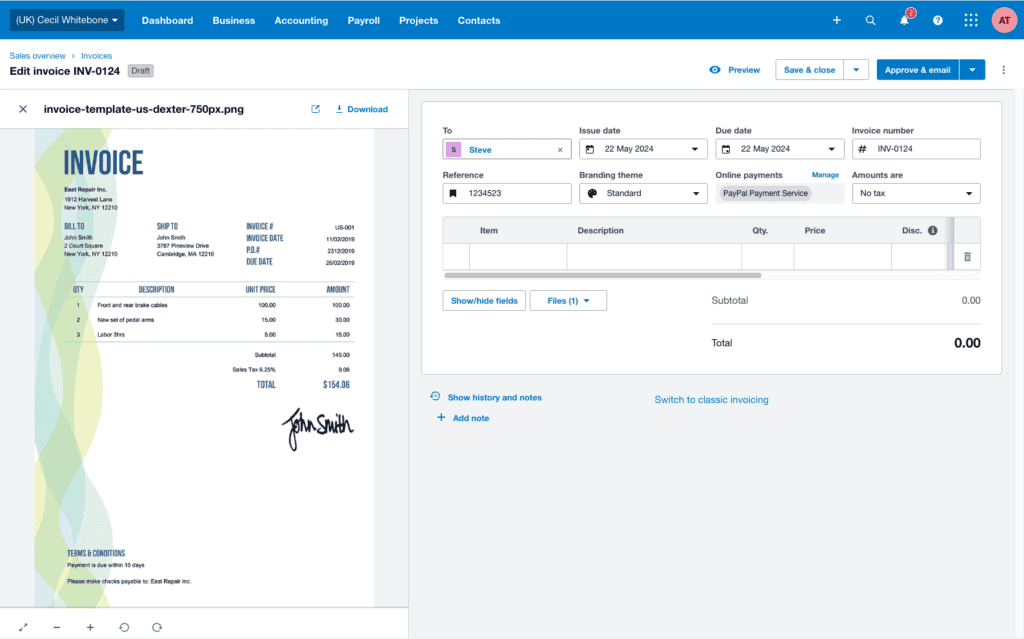
Our teams always planned on making sure you can attach files from your Xero library, but learning how useful it is for you to preview them in the same window while you enter invoice details meant we sped up the delivery of this release.
And that’s not all. Here are a few more experiences we’ve delivered in the last three months that have minimised the number of clicks and made it easier to breeze through invoicing tasks.
With one click, you can now:
- print and download your PDF invoice, packing slip, or file
- create another invoice right after approving an invoice
- send a receipt right after applying a payment
- mark invoice as sent when prompted after printing
We’ve also made these improvements to keyboard commands:
- hitting tab in the branding and tax fields will both select, and move focus to the next field
- you can now start typing immediately in the date field when in focus
And, we’ve made viewing key information easier, including the ability to:
- quickly spot the branding theme used for approved invoices
- see the invoice number in the browser tab
When it comes to invoicing design, we want to focus on making changes to help ease the transition to new invoicing and make your workflows even faster. Our teams are now doing even more detailed user research where we sit next to users and actually see them click and tab through the invoicing screens, giving us quality insights about the everyday scenarios you encounter, and reinforcing the importance of speed.
Are you interested in providing your invoicing insights?
We believe these are small but mighty changes to the new invoicing experience, and we’re looking forward to delivering more in the near future.
One upcoming change that is underway is work to improve the readability and screen real estate in the top half of the create invoice page. Here’s a sneak peek at the design changes proposed.
The current layout:
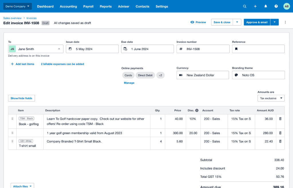
The proposed layout:
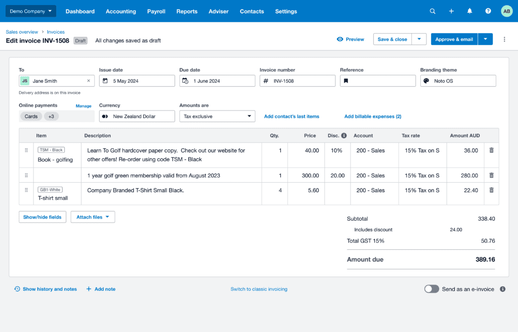
We are still actively talking to users about these changes to the layout and making adjustments. If you would like to be part of our beta program to test the build of our features, and share your feedback directly, please sign up to partner with us to co-design an even better experience.


