Table of Contents
Popular this week
Jun 25, 2023
Changes are coming to the contact overview page
Last updated: Dec 4, 2025

Last updated 27 July 2023
Changes are coming to the contact overview page
We wanted to share the next step in improving the contacts experience in Xero, helping you better manage the relationships with your customers and suppliers, as well as your cash flow.
We’re excited to share that we’ve updated the design of our contact overview page, and introduced search and filter functionality. This will make it easier to find the information you need quickly.
These changes are all part of our multi-year modernisation program, to stay ahead of the latest technologies, standards and ways of working to support your business or practice. They will play a crucial role in helping us unlock further improvements and build features faster in contacts and across the Xero platform in the future.
What’s changing?
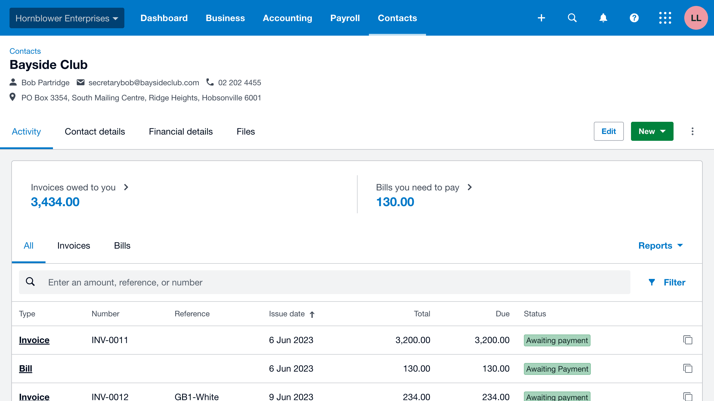
A redesigned contact overview page
The redesigned contact overview page will make it easier to find the information that you’ve told us is most important. On this page, you’ll notice the following updates:
- The contact’s main information (key contact details and financial activity summary) is now at the top of the page, so it’s available at a glance
- Activity and transactional information is grouped into tabs, so you can easily see the contact’s financial stance – you no longer need to constantly scroll to access this information
- History and notes has moved to its own section at the bottom of the page – this is consistent with other parts of Xero.
- ‘Add to group’ and ‘Remove from groups’ have been combined into ‘Manage groups’ found in the overflow menu

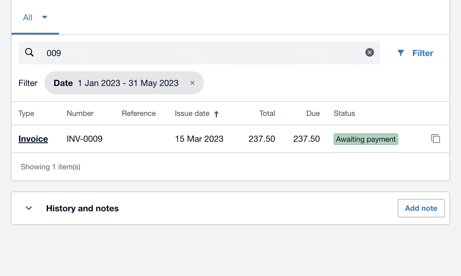
Introducing search and filter
As a result of your feedback in Xero Product Ideas, we’ve introduced a new search and filter functionality to help you easily find relevant information and transactions. Select the summary of what’s owed or owing to you to see the transactions awaiting payment. Or, navigate to the invoices, quotes, bills or purchase orders tabs to search by those categories. You can also filter by dates to narrow your search down even further.
This feature makes life that little bit easier for you to find the information you need more efficiently. It’s also something you’ve been asking for, so we’re excited to roll this out as part of these wider updates to contacts.

Other updates
- User roles and permissions: Information that you see on the contact overview page has been aligned with information you can see in other areas of Xero based on your user role and permissions.
- The money in/out graph has been removed
- Notes on contact activity have been moved to the history and notes section at the bottom of the page
- Contact notes are now within the contact details section
- We’ve removed the Skype field. If you have Skype details stored, you can export the Skype details in a CSV to access them
- Classic expense receipts can now be found in expense claims in the business menu
- The feature to add a file from the file library has temporarily been removed from the contacts screen. For now, you will need to download the file from within your file library before you can attach it to a contact record
The future of contacts
These changes are more than just aesthetic. They are upgraded functionality that bring us another step towards delivering more features you’re asking for, such as multiple addresses in contacts. We appreciate your patience, as we continue to build strong foundations for the future to provide you not just surface improvements but the features you’re asking for.
As always, we’ll keep you informed with our next steps on this journey. Our product teams are constantly working on improving the contacts experience and we would love to know what you think – please let us know over on the Xero Product Ideas page.


